
Have you been staring at your bare windows and wondering how to make them pop? Choosing the right window colour combination can completely transform the look and feel of your space. Whether you want to create a dramatic focal point, balance out the proportions of a room or tie together an eclectic interior style, playing around with different window colours and patterns is an easy and affordable way to make a big impact.
From bright accent windows that pack a punch to complementary hues for a cohesive look, there are so many stylish options to inspire your next window makeover. Read on for some of the hottest window colour combination ideas you’ll want to steal for your home.
The Importance of Choosing the Right Window Colour Combinations
The colours you choose for your windows can make or break the look of your home. Get the combination right and your place will be envy-inducing. Get it wrong and, well, you’ll be repainting sooner than you hoped!
When picking window colours, think about the overall style of your home and the mood you want to create. For a bold, dramatic look, consider deep shades like navy, forest green or burgundy. Pairing complementary colours like blue and orange or red and green creates visual contrast.
For a bright, cheerful vibe, try pale hues such as mint, peach or sky blue which allow plenty of natural light to filter through. You really can’t go wrong with crisp white – it’s a timeless choice that works with any architectural style.
With some thought about style, natural light needs and how the windows relate to the rest of your home’s exterior, you can come up with a colour combination you’ll love for years to come.
Classic and Timeless Window Colour Combinations
There’s nothing quite like classic colour combos that stand the test of time. Some window colour pairings are eternally stylish and help create a warm, welcoming space.
Blue and white
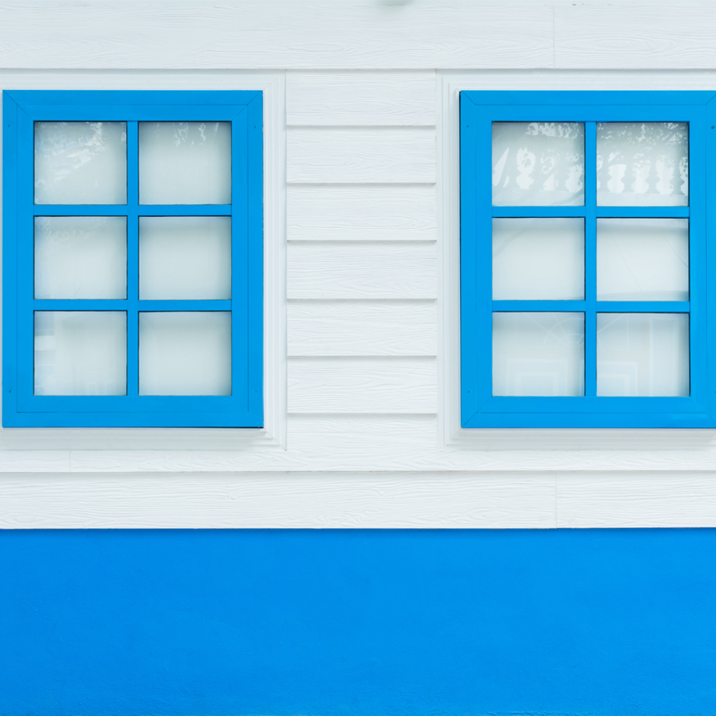
The nautical-inspired blue and white combination is fresh and bright. Whether it’s navy blue shutters against crisp white walls or blue and white striped curtains, this colour duo is perfect for a beachy, calming feel. For a pop of contrast, add touches of red in accessories like cushions, rugs or planters.
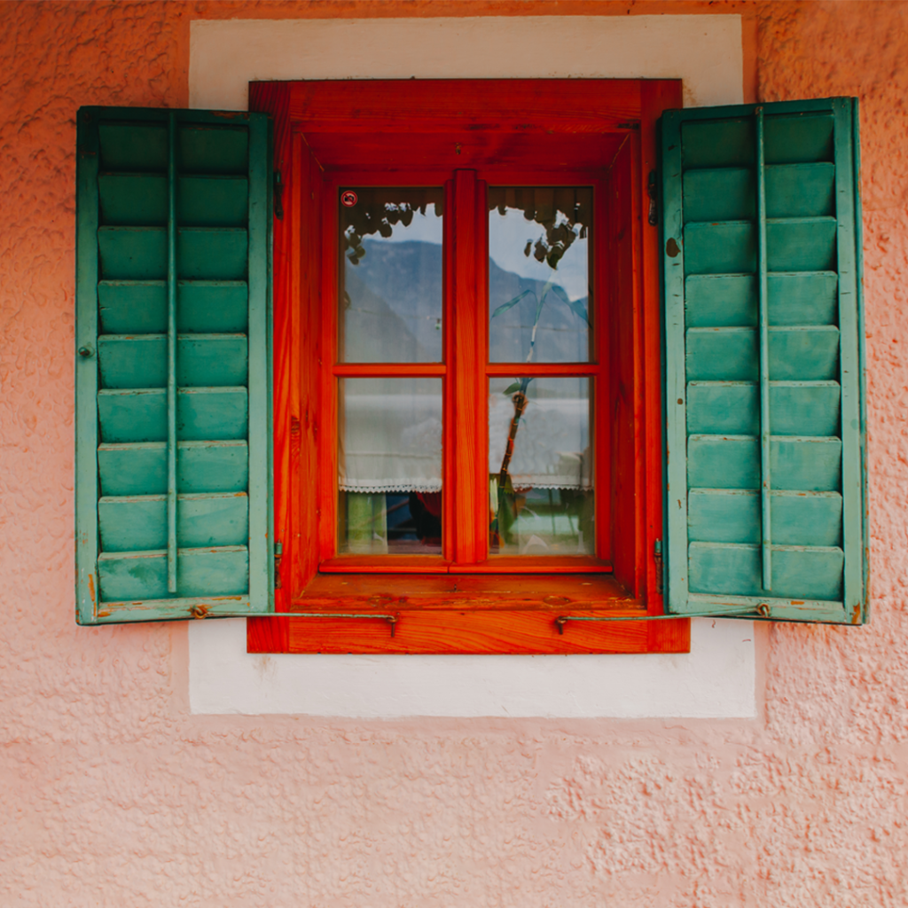
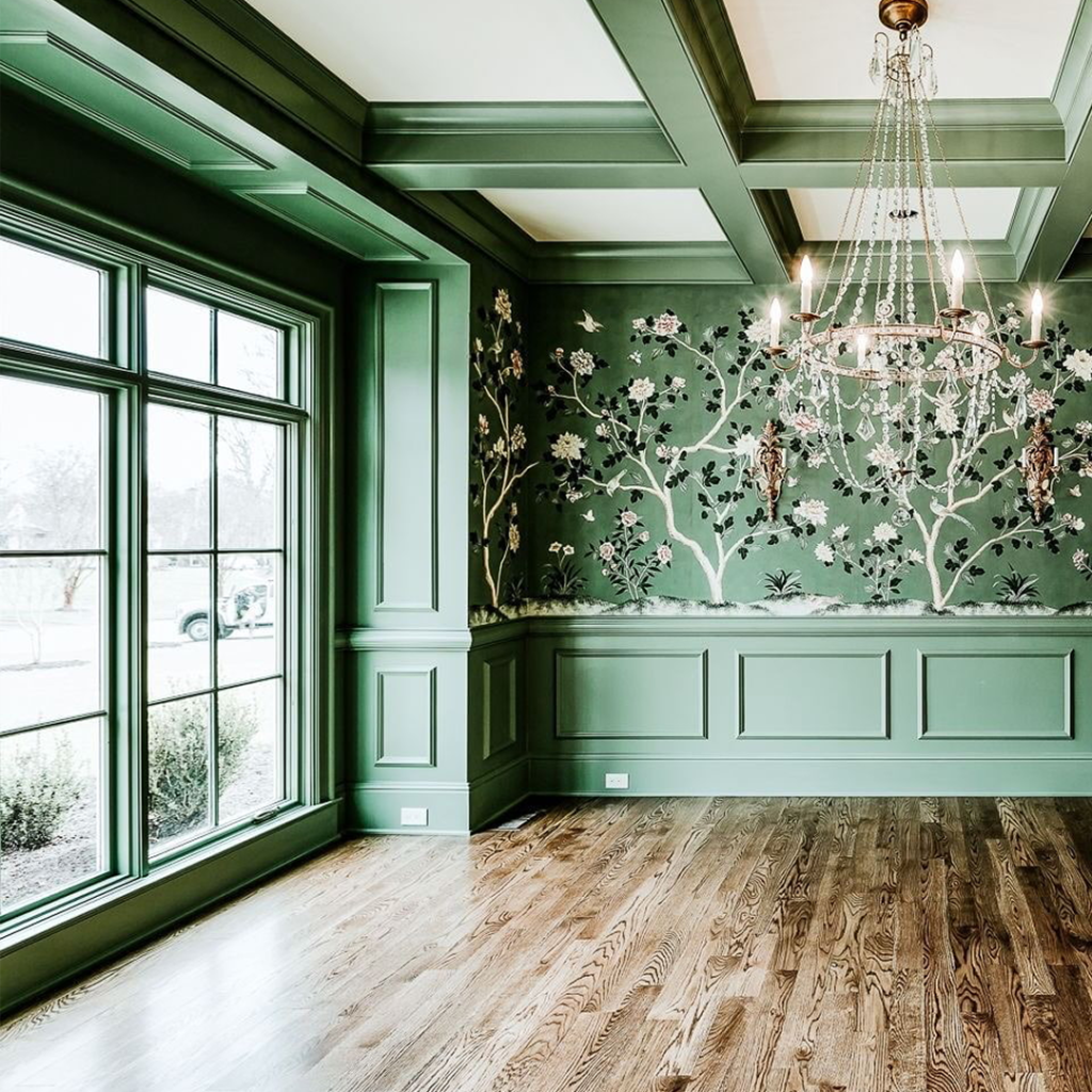
Green and natural wood
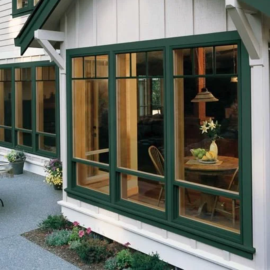
The earthy pairing of green and natural wood evokes a sense of organic cosiness. Forest green window frames or shutters coupled with bare wooden sills and ledges bring nature inside. Accent the space with houseplants, woven baskets and textiles in complementary hues of olive, moss and tan.
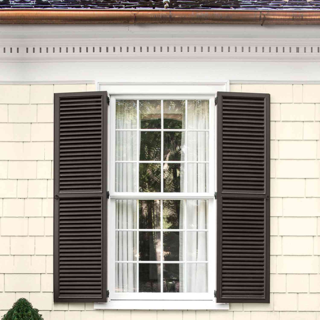
Black and white
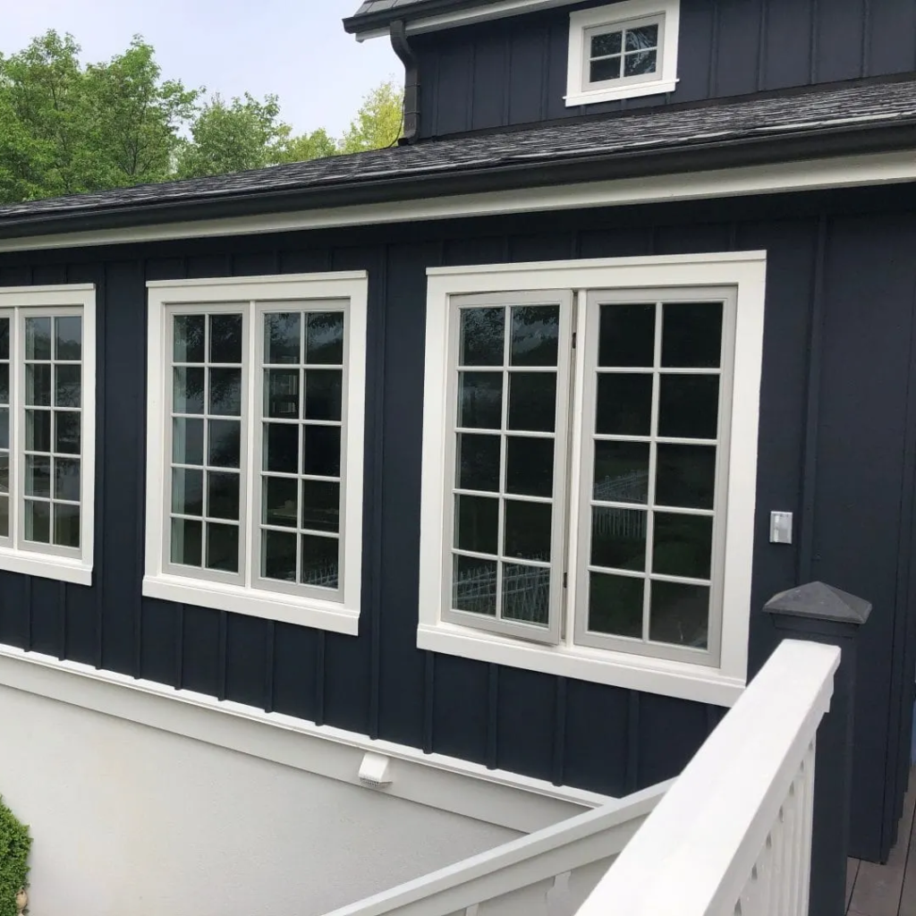
For dramatic effect, the black and white colour scheme can’t be beat. Black window frames and sills provide a bold base for breezy white curtains. Or make a statement with black and white patterned roller blinds. The contrast is stark yet stylish. Add metallic accents like brushed nickel or pewter for a contemporary twist.
With these classic colour combinations, you really can’t go wrong. Keep the pairings uniform for a cohesive look or mix and match for eclectic charm. Either way, your windows will be dressed to impress while standing the test of time.
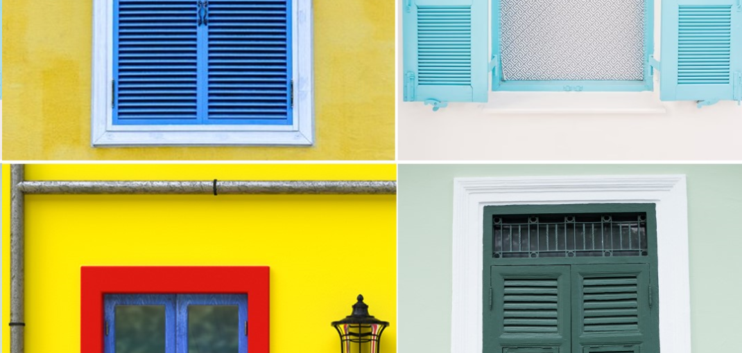
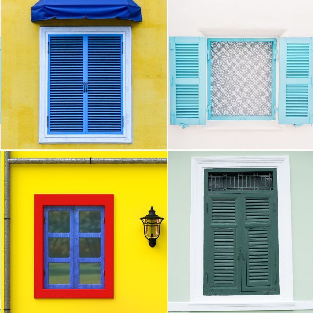
Modern and Trendy Window Colour Combination Ideas
Modern colour combinations are all about experimenting with bright, bold hues. If you want windows that make a statement, consider these trendy combos:
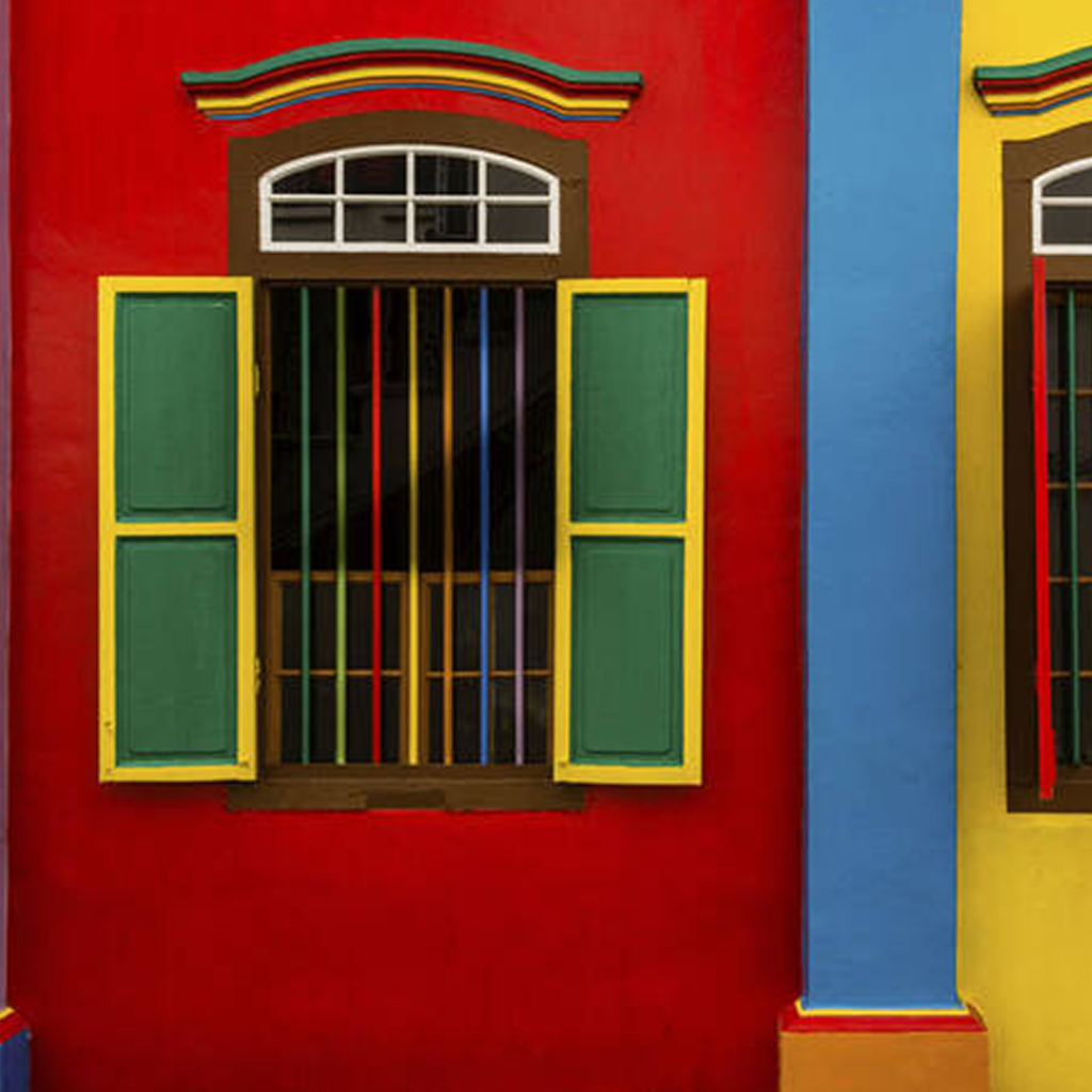
Blue and yellow
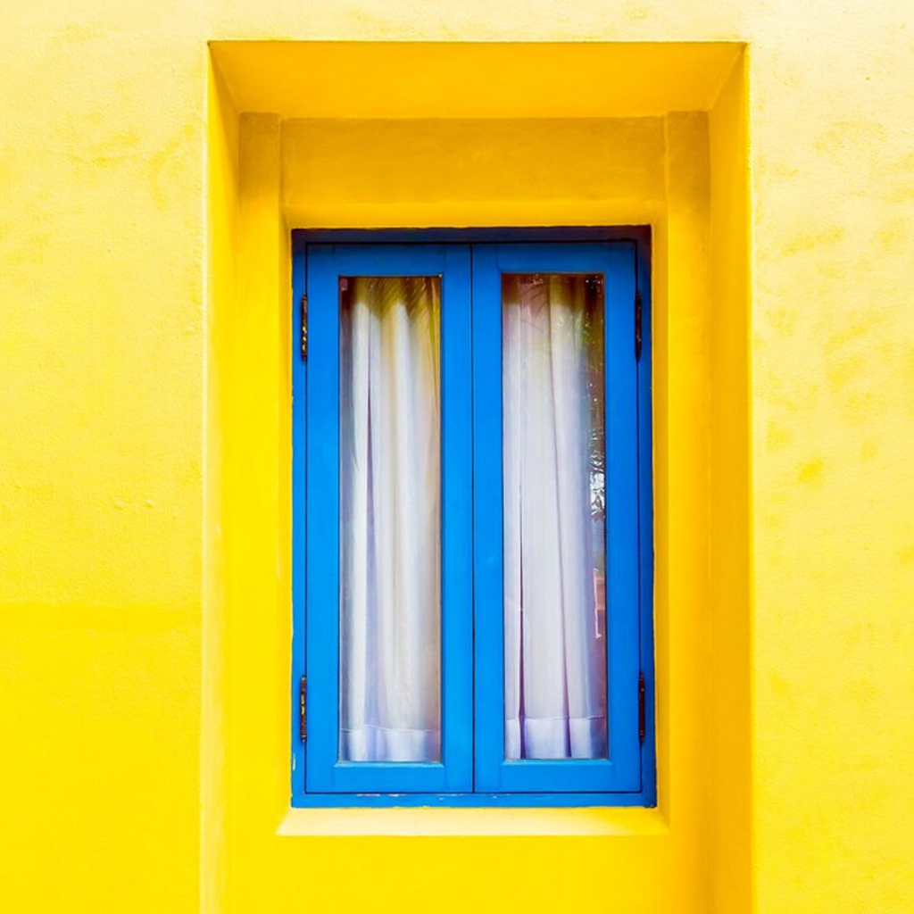
Nothing says cheerful like a combo of blue and yellow. For a bright, fun look, paint the top half of your window frame blue and the bottom half yellow. Or do alternating blue and yellow vertical stripes. Pair it with white walls for a crisp, beachy vibe.
Green and pink
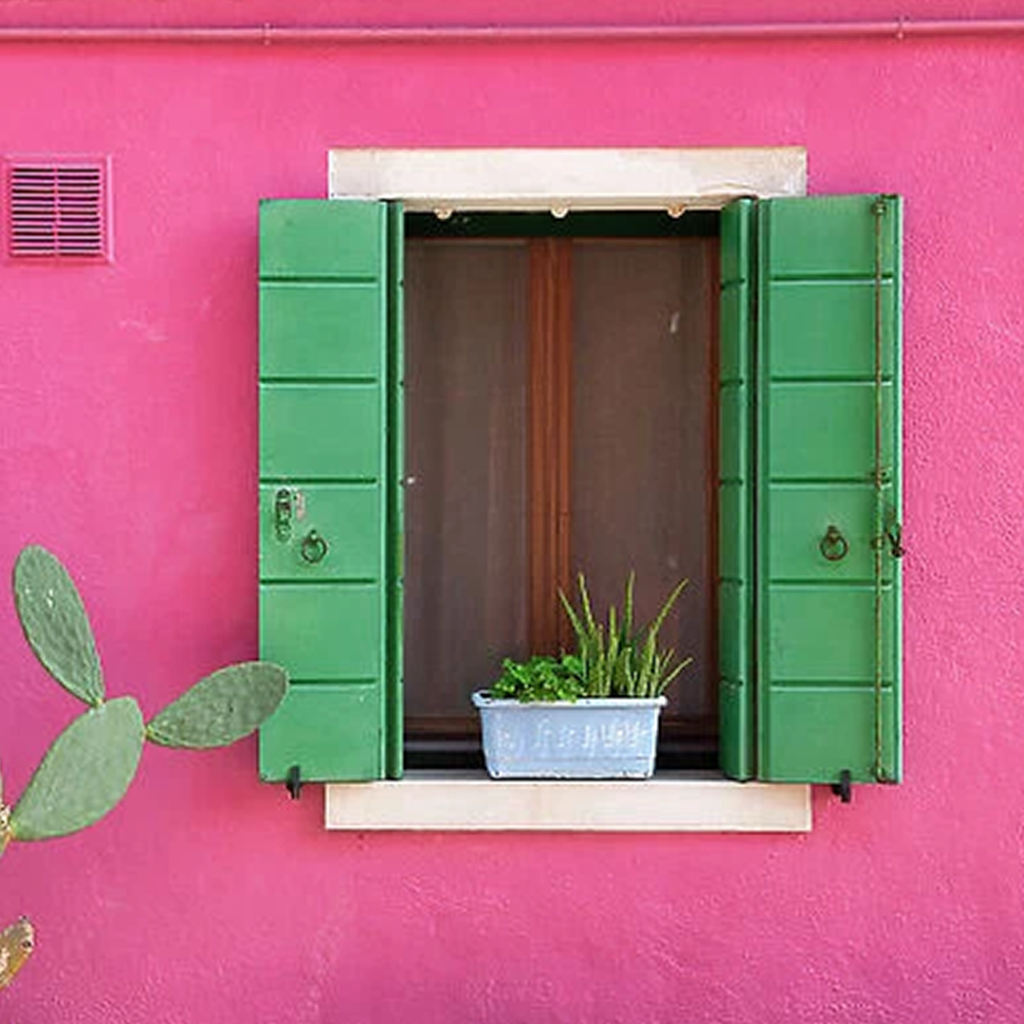
Forest green and millennial pink are unexpectedly perfect together. For a whimsical, romantic feel, do a green window frame with pink accents. This colour duo is ideal for a shabby chic or bohemian space.
Red and turquoise
The vibrant red and bright turquoise play well together for a kitschy 1950s diner vibe. Balance out the bold colours with neutral walls and flooring. This retro-inspired colour combo is quirky, playful and sure to spark nostalgia.
Whether you want to make a cheerful, romantic or dramatic statement, mixing unexpected and vibrant hues on your windows is an easy way to make a stylish splash. Be bold and have fun with colour—you can always change it up again! Modern colour combinations give you the freedom to experiment.
What to Avoid When Choosing Window Colour Combinations
When choosing window colour combinations, there are a few things you’ll want to avoid to ensure your space looks cohesive and stylish.
Mismatching Colours
Don’t pair complementary colours like blue and orange or red and green. These combinations can appear jarring and make a space feel chaotic. Instead, choose analogous colours like blue, blue-green and green or monochromatic schemes using different shades of one colour.
Too Many Colours
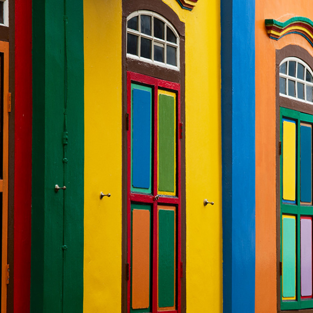
Limit yourself to 2-3 main colours for your windows and accents. Having too many competing colours will make your space feel busy and disorderly. Choose a primary colour for your windows, a secondary accent colour in small doses, and possibly a tertiary colour for small details. More than that risks looking like a rainbow threw up in your room.
Dark Colours in Small Spaces
In a small space, dark window colours can make a room feel cramped and cave-like. They absorb light rather than reflecting it, making the space appear smaller. For small rooms, stick to lighter, brighter colours which help open up the space. Save the dramatic dark hues for larger rooms where they won’t feel overpowering.
Matching the Walls
Avoid choosing window colours that exactly match your wall colour. While cohesion is good, matching your windows to the walls makes a space feel flat and boring. Choose window colours that complement your wall colour instead. A shade lighter, darker or more saturated will create subtle contrast and visual interest.
Expert Tips for Picking the Perfect Window Colour Combination

When choosing a colour combination for your windows, keep these expert tips in mind:
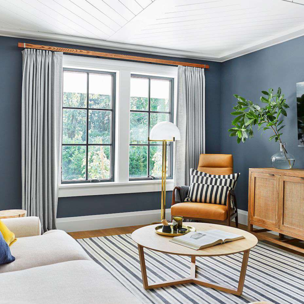
Consider the room’s existing colour scheme.
Try to pick window treatments that complement the walls and furnishings. If you have a vibrant space, opt for solids or simple patterns in similar or contrasting shades. For neutral rooms, bold or bright colours can make a dramatic statement.
Think about the amount of natural light.
Rooms with lots of windows and sunlight can handle dramatic, darker shades since the space won’t feel closed in. For dim rooms, stick to light, airy colours like cream or white to keep things bright. Sheer, lightweight fabrics also allow more light to filter in.
Decide on a style.
The style of your home will influence your window colour choices. Modern spaces suit sleek solids like grey, white or black. Cottage-style homes call for floral prints, gingham or lace. Consider treatments like Roman blinds for a minimalist look or drapes for a more traditional feel.
Consider practicality.
Blackout options block light for media rooms or bedrooms. Thermal linings provide insulation. Washable fabrics are ideal for high-traffic areas. Cordless or motorised styles are safer if you have kids or pets.
View samples in the actual space.
Seeing colours in person can be surprising. Order fabric swatches or borrow samples from a store to view in your home. Natural lighting gives the most accurate impression of how a colour will look. Take photos at different times of day to compare.
Don’t be afraid to mix and match.
Combine multiple colours, patterns and textures for a custom look. Use a patterned fabric for drapes and a solid shade for blinds. Mix dark and light colours for contrast. Just make sure there’s a common colour thread tying it all together. Coordinating, not necessarily matching is the key.
With some planning and experimenting, you’ll find a perfect window colour combination to brighten up your space. Don’t be afraid to take risks – you can always redecorate down the road!
Conclusion
So there you have it, some striking yet simple window colour combination ideas to inspire your next decorating project. Don’t be afraid to mix unexpected shades or go bold with your colour choices. Your home is a canvas for self-expression. These eye-catching combos are guaranteed to make a statement and transform the look of your space. What are you waiting for? Grab some paint chips or fabric swatches and start creating colour magic. Unleash your inner decorator – your rooms and your mood will thank you for it. Who knew a little colour could make such a big impact? Go on, give one of these colour pairings a try. You can always change it up again next season!
Why is choosing the right window colour important?
Window colours enhance your home's aesthetic, contributing to visual harmony and complementing the overall design.
What are popular window colour combinations?
White frames with black trim, earthy tones with dark shutters, and monochromatic schemes are commonly favoured.
Are there trends in window colour combinations?
Trends vary, but as of 2023, black window frames were popular for a modern look. Choose colours that match your style.
Do window colours impact energy efficiency?
While colour itself doesn't, energy-efficient glass and frames can maximize energy savings.
How do I maintain window colours?
Regular cleaning and maintenance are crucial. Follow manufacturer guidelines and consider touch-ups or repainting if needed.